Case Study · 06
Townminute
Los Angeles decides something every week, and most people hear about it after the vote. Townminute is a map of your town that keeps the minutes. It tells you what the city is deciding this week, in one minute, and helps you show up with people who care. The brand had two jobs: tell time, and look like a town.
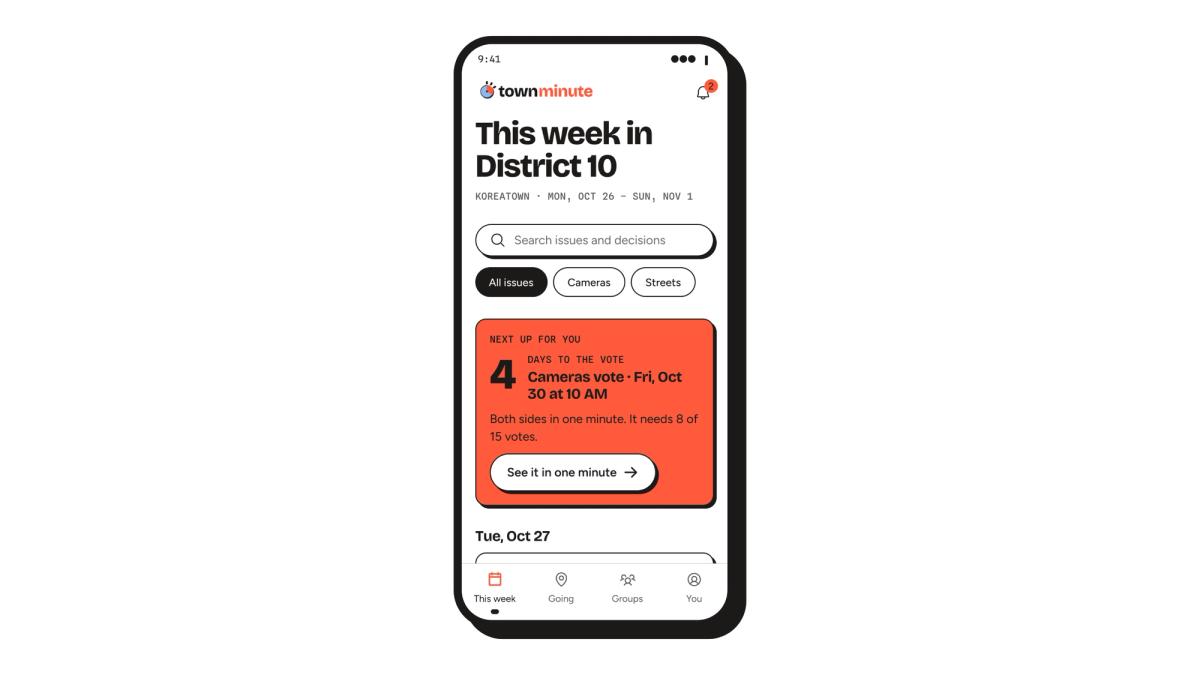
The idea
A map of your town that keeps the minutes.
01 · Tension
Most people find out after the vote
Townminute started with a question from our Art 646 studio: how might we get people to engage with local government for real, and build a community around the issues it decides? Andrea and I split it down the middle. I took the civic side, knowing what the city is deciding. Andrea took the community side, the people who show up together.
We started with the record itself. Every week the City of Los Angeles decides something: a camera contract, a speed limit, a rent rule. All of it is public, and almost none of it is readable. It lives as a PDF on an agenda portal, posted days before the vote and written for the people already in the room. There are fifteen council districts, and most residents find out after it’s done.
Our first version tried to do everything, and the app nearly broke under it. Testers told us there was too much. Testers and instructors both told us the visual language was too quiet to carry any of it. So the work became one move, repeated: turn the scope down and the volume up. The app came back to the two halves we started with. Know what the city is deciding, and go to it with your neighbors.
That gave the brand its problem. A seal says city. It doesn’t say this week. The identity had to be loud enough to stop a thumb on vote day and quiet enough to read on the bus every other day.
02 · Source
A clock and a hillside
The name came first, and the visual language followed it. Every government meeting keeps minutes, the record of what was decided. Townminute is the town’s minutes. The word gave us two things to draw: the record, and the clock.
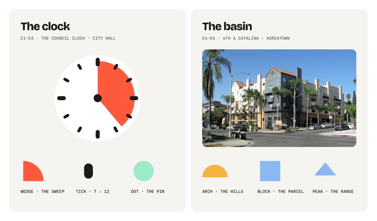
So the language had two drivers, time and Los Angeles. Time came from the council clock in City Hall: the sweep of the minute hand, a mark for every minute, the pin it all turns on. The town came from the basin seen from 4th and Catalina: hills at the end of every street, the parcel the city is deciding about, the range behind all of it.
Then we gave each color one job and wouldn’t let it take a second. Tomato is time. Mint is people. Amber is the town, Sky is the city, and Asphalt is the ink. White is the room.
03 · Alphabet
Six shapes you could cut from paper
Our first visual language didn’t survive. When we tested it beyond the app, it went bland. So we rebuilt it as a flexible visual system: a small set of shapes that could push color and form hard and still speak in one consistent voice.
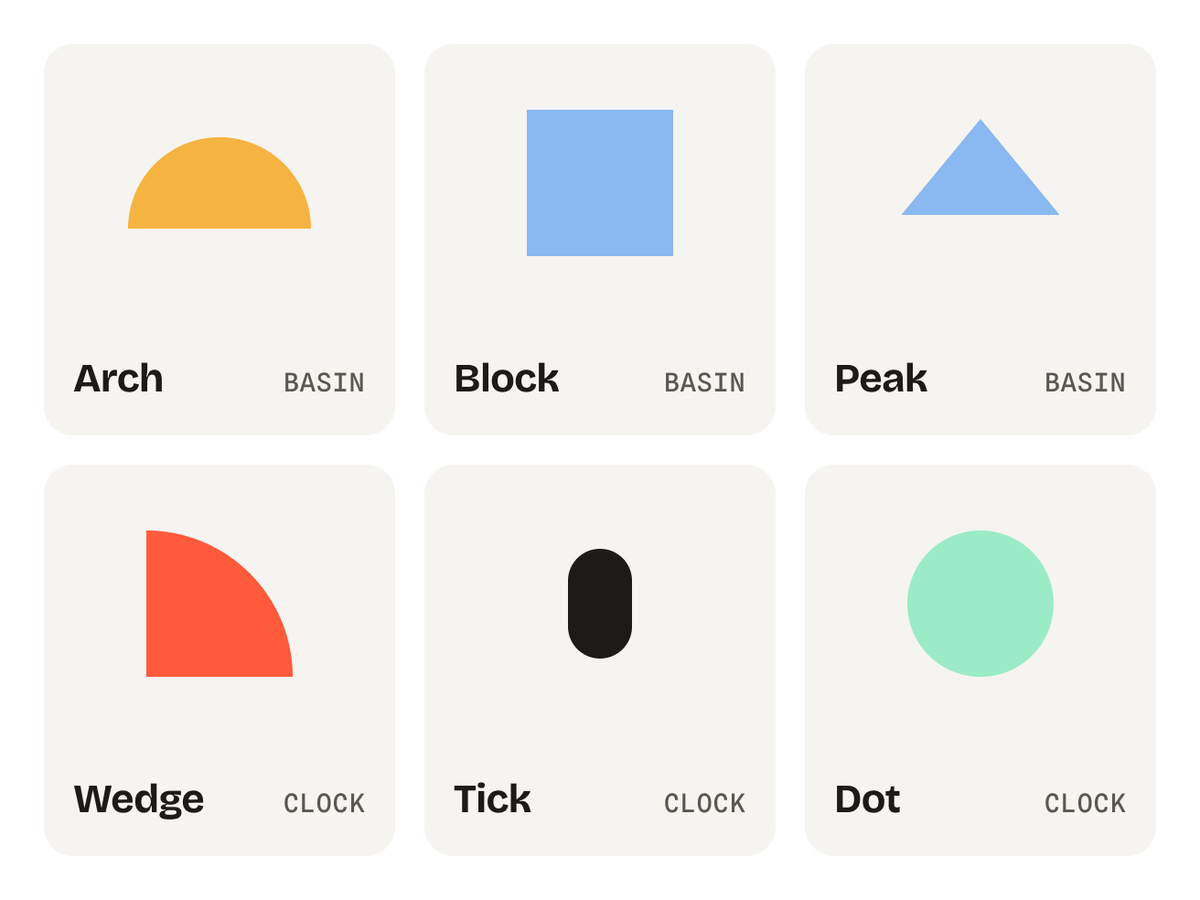
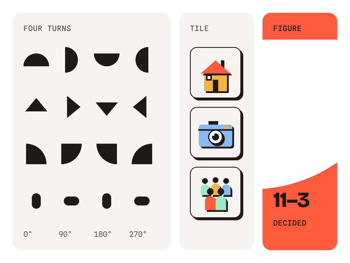
From the clock and the basin we pulled six letters. Wedge, Tick and Dot came from the clock. Arch, Block and Peak came from the basin. Each is a flat shape, and it only ever turns in 90° steps.
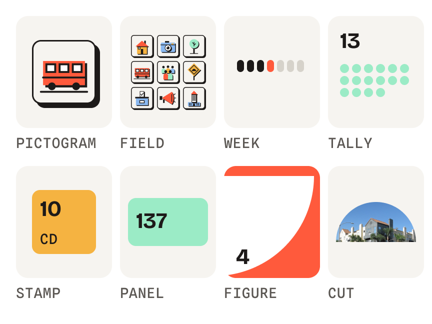
The letters ended up with two ways of speaking. In Tile, they sit inside a square cell and build pictures. In Figure, one letter outgrows its surface and gets cropped by the edge. We saved Figure for when something has actually happened.
04 · Vocabulary
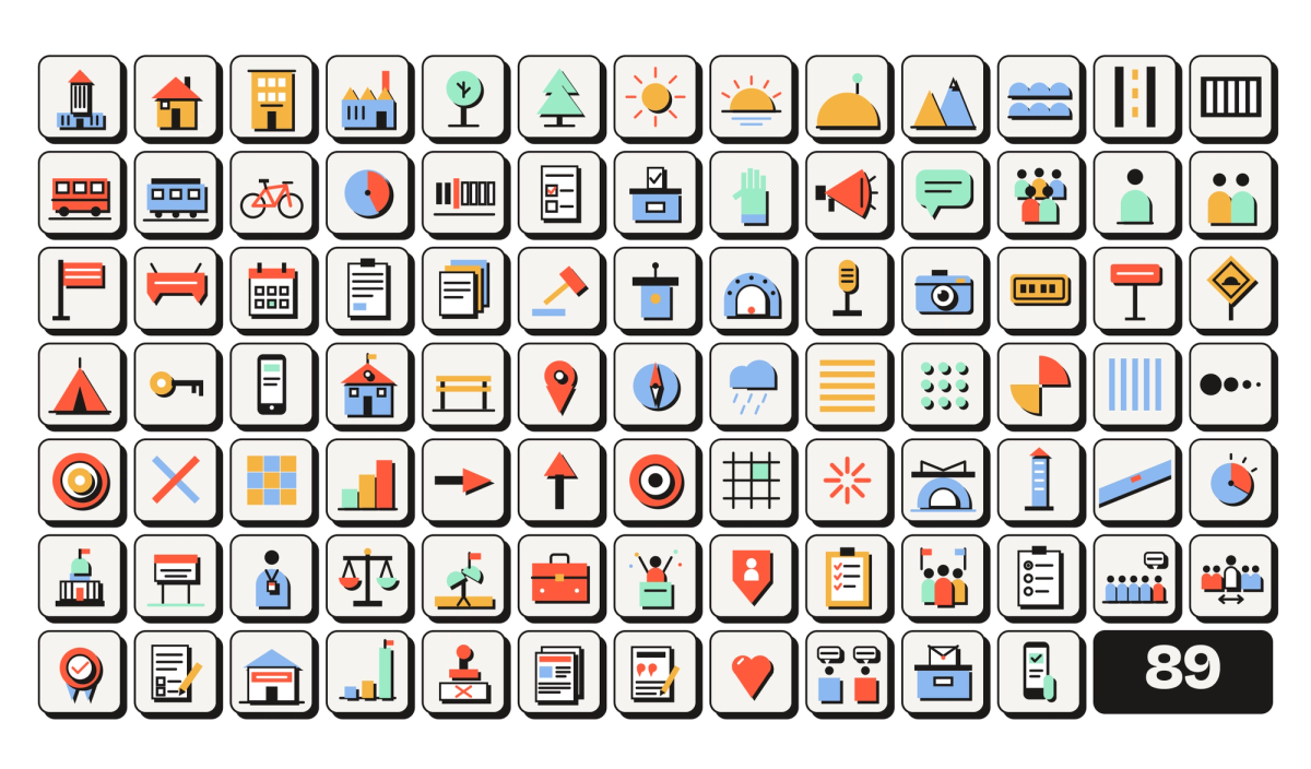
89 pictures, one set of shapes
An alphabet only counts if it can say things, and ours had a lot to say, from a city hall to a swing vote. We started with two icon sets and merged them into one library of 89 pictograms. The rule survived the merge: every picture is the same six letters in the same five inks. Cells, fields, the week, the tally, the stamp and the panel arrange them into the things the app needs to say.
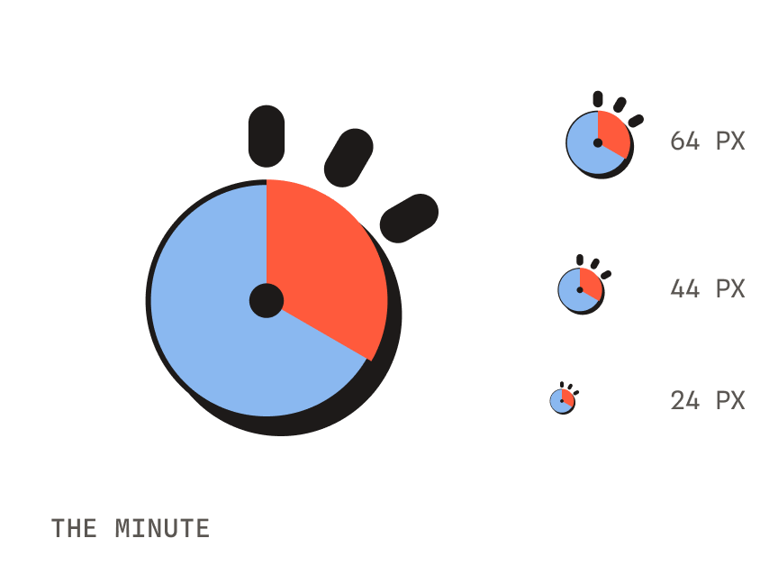
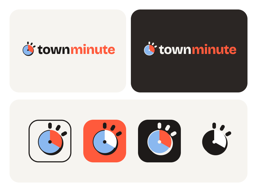
The logo came out of that vocabulary. It’s the minute: a Sky dial, a 120° Tomato wedge, and three ticks for the first minutes. The wedge is the minute hand mid-sweep, and a third of the dial gives the mark enough weight to hold its own. It’s one word in the system, and we never let it be the headline.
05 · Grammar
Loud only when it counts
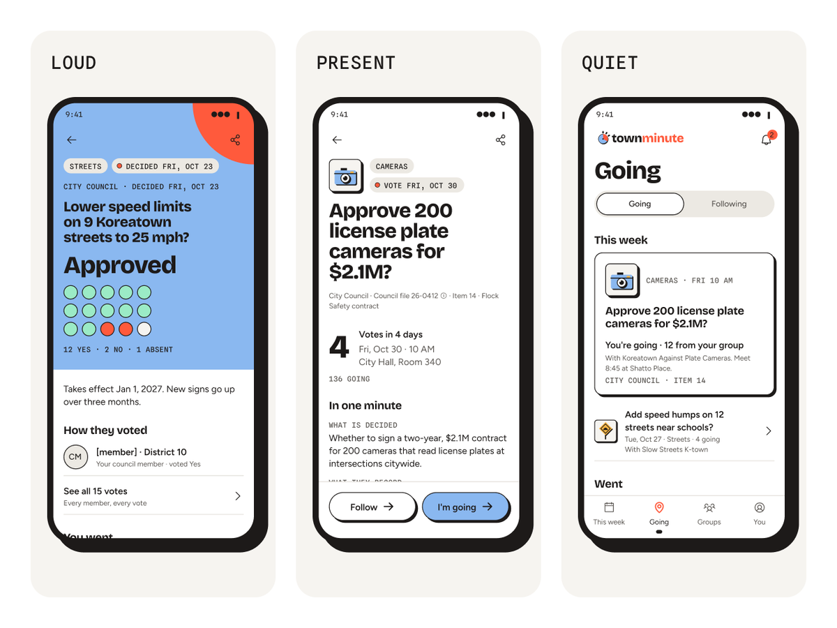
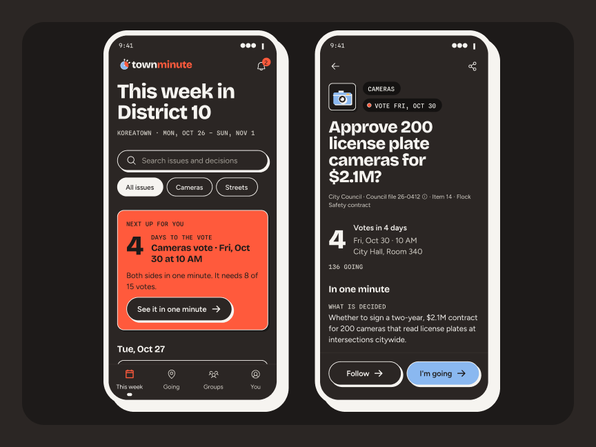
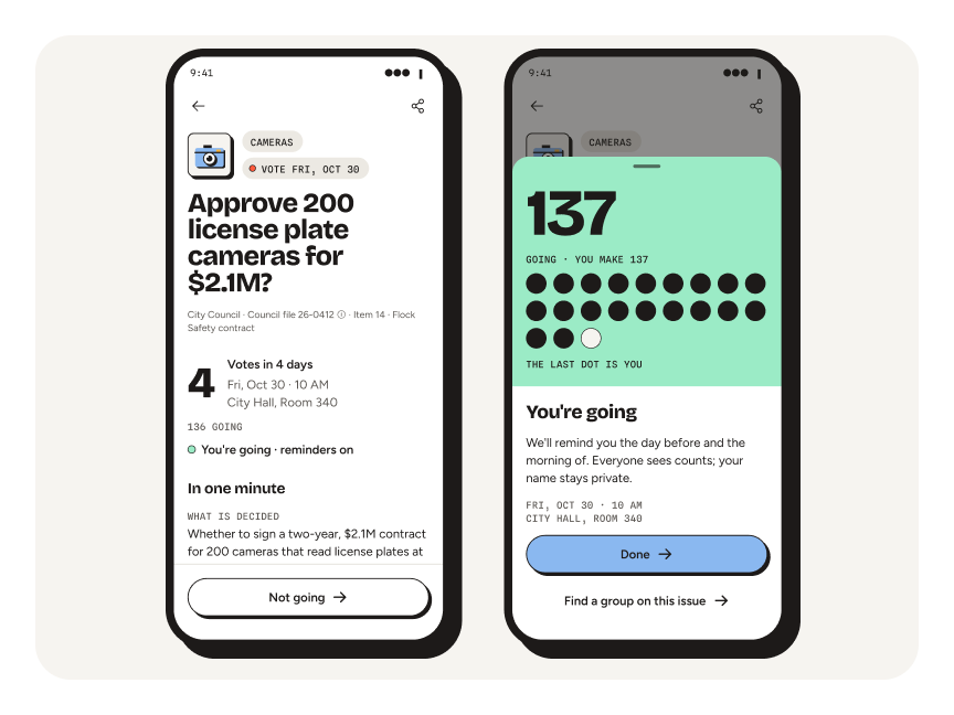
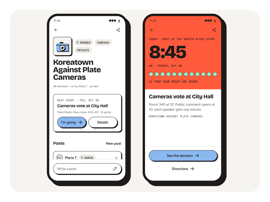
Turning the volume up raised the next question, which was when. We set volume by the moment instead of the screen. Every screen is Loud, Present or Quiet, and Loud has to be earned. There are seven loud moments, from first open to an event happening today, and each one carries a real count or date. Everywhere else the page stays white and the type does the work.
Five rules keep it honest:
The rules
- R1White is the room. Chalk is the tile. Color fills a surface only at a loud moment.
- R2Tomato tells time and Mint means people. Neither ever means error, warning or decoration.
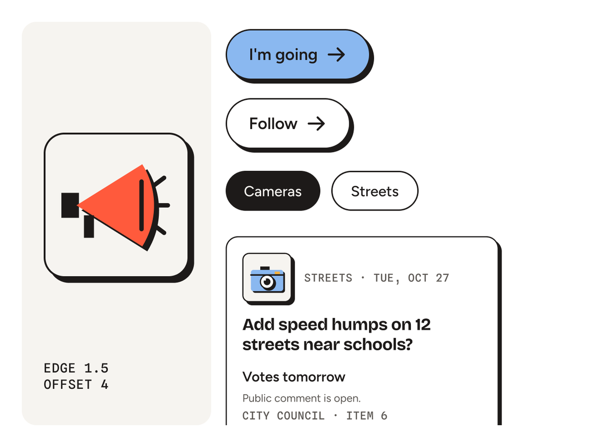
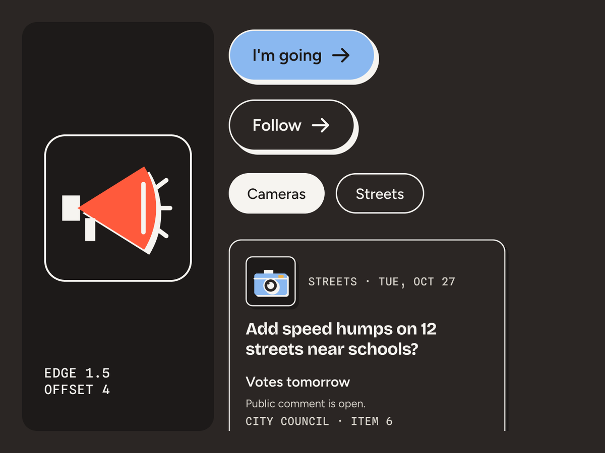
- R3If you can press it, it has an edge. If you can’t, it doesn’t.
- R4Big enough for the bus. Nothing on a phone under 14 pt, no tap target under 48, AA contrast in both modes.
- R5One loud moment per flow, and it always holds a real count or date.
06 · Bridge
The edge becomes the button
We didn’t plan this part. Settling the pictogram look took dozens of rounds and hundreds of drawn logos and icons, and for a long stretch the brand and the product felt like two separate projects. Then we saw it. The ink outline and hard offset that frame each pictogram cell could frame anything you can press. They became the outline of every button, chip and field, so anything you can press looks like it.
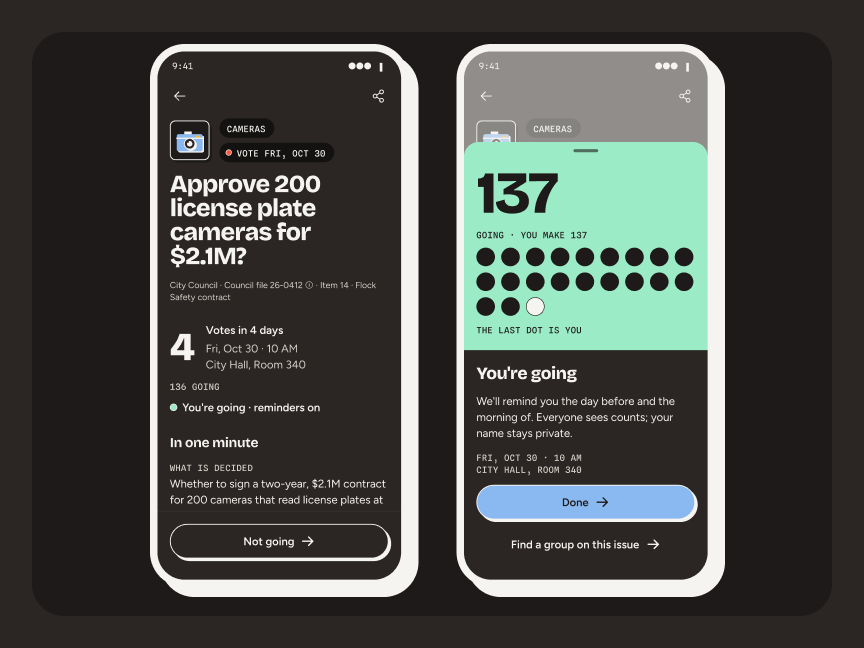
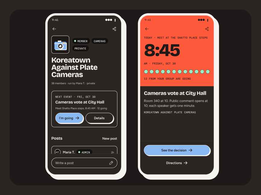
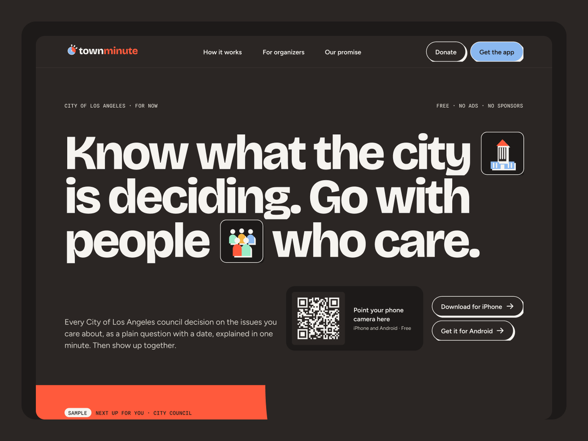
Tokens carry the inks into the product by job. That’s why the primary button is city blue: Tomato is reserved for time. Flip to night mode and white turns to Asphalt on every screen, with every line of text still passing AA.
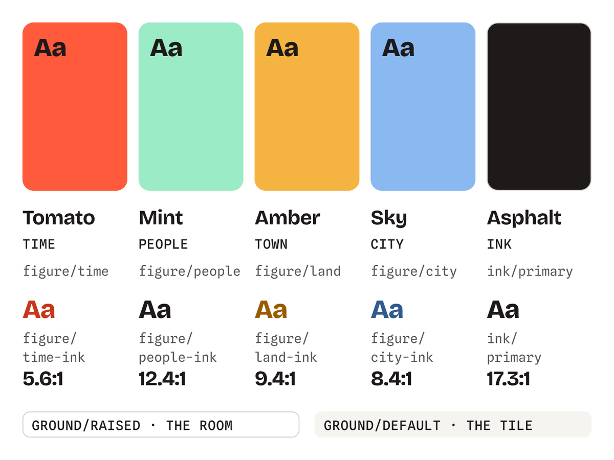
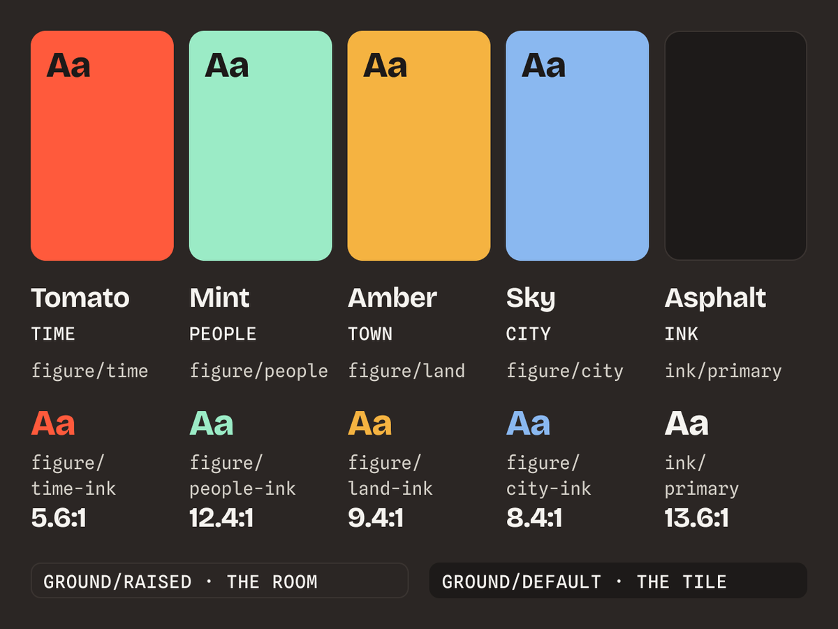
Tokens · Five inks → Semantic → Daylight / Night
07 · Formats
Where we tried to break it
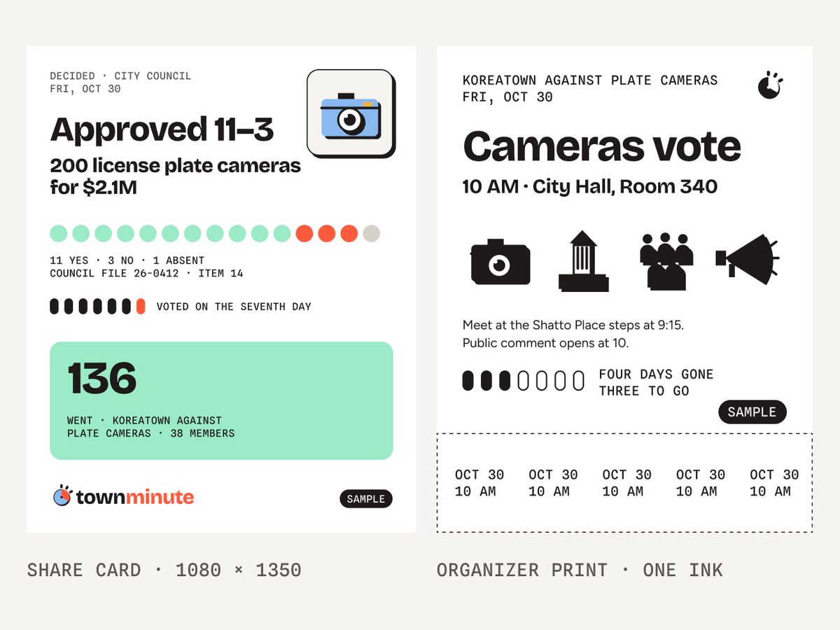
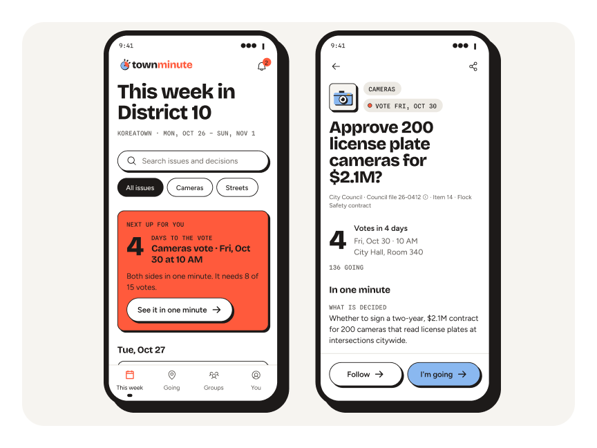
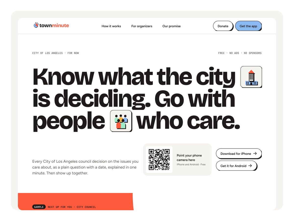
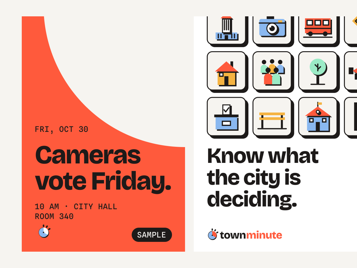
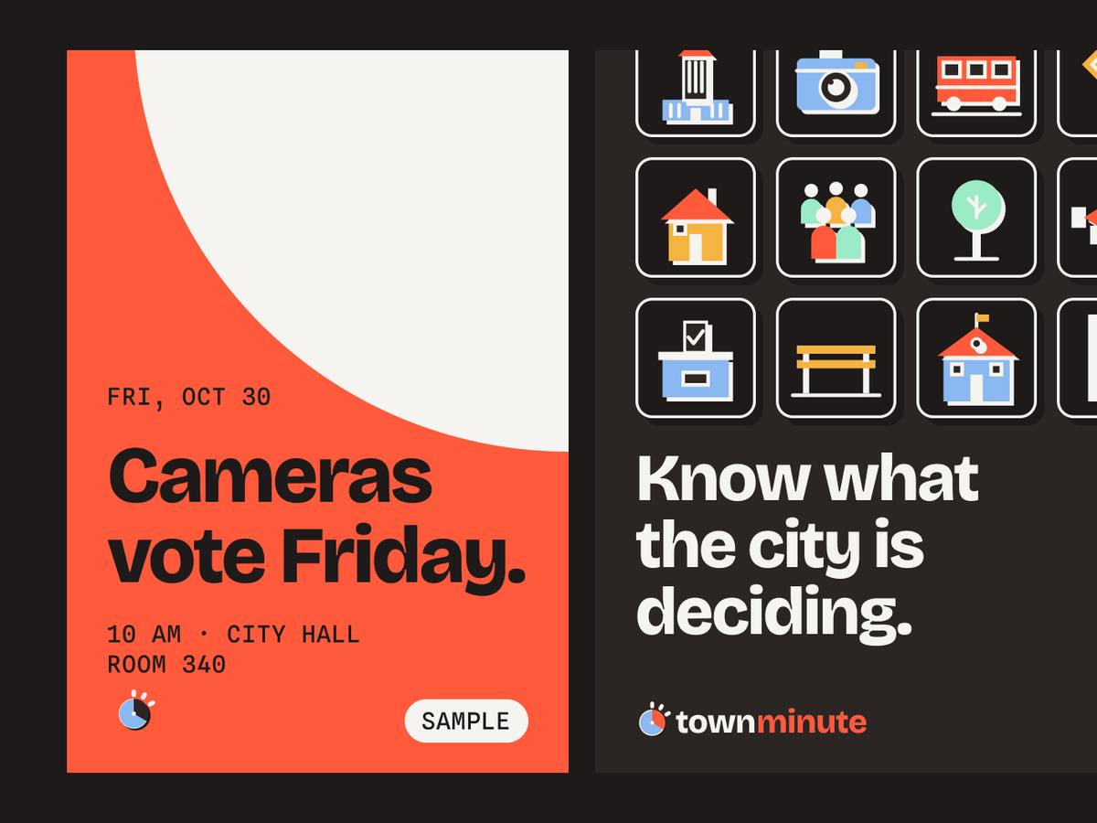
We picked four surfaces. The phone, where everything happens. A one-pager that has to explain the whole app in one scroll. A bus-shelter poster that has to carry one date across a street. And all three at night. This is the test our first visual language failed.
If it reads on the bus at noon and on the same bus at midnight, it’s done.
08 · Generated
Work nobody drew
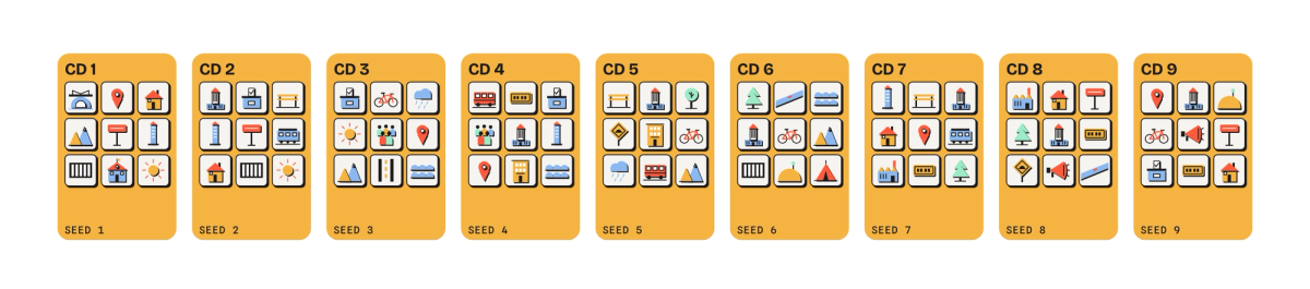
This was the last test. Each district gets a field of nine pictograms. In the product, those nine come from the district’s open issues. Here, a seed set to the district number picks them. Same letters, same rules, a different field for all fifteen districts. Even the pictograms are generated: all 89 are written as recipes on a 100-unit grid and drawn by a script.
“Turn the scope down and the volume up.”
The record was always public. Now it’s on time.
Speculative studio project · Team 7 · Andrea + Zach · Art 646 · Not affiliated with the City of Los Angeles
Next Project · 01
LegendA speculative brand identity for Apple's acquisition of Legendary Entertainment.