Case Study · 04
RWJBarnabas Health
A brand identity system for an academic health network
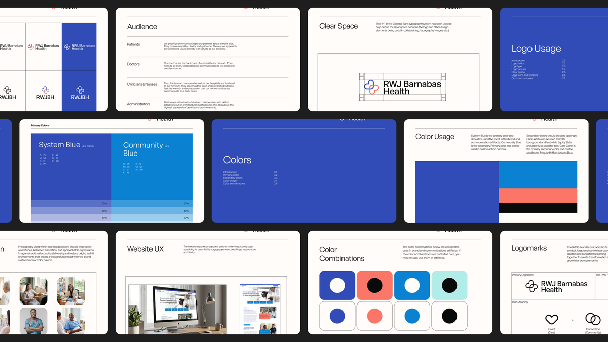
01 · Challenge
Academic health networks are some of the hardest brand problems out there. They're not single hospitals, they're constellations: multiple campuses, dozens of specialty practices, thousands of providers, layered partnerships with universities, serving patients who are often scared, confused, or walking into the system for the first time. A new logo won't fix that. The real work is building one experience across the whole network, from the first ad a patient sees, to the wayfinding that gets them to their appointment, to the discharge instructions they read at home.
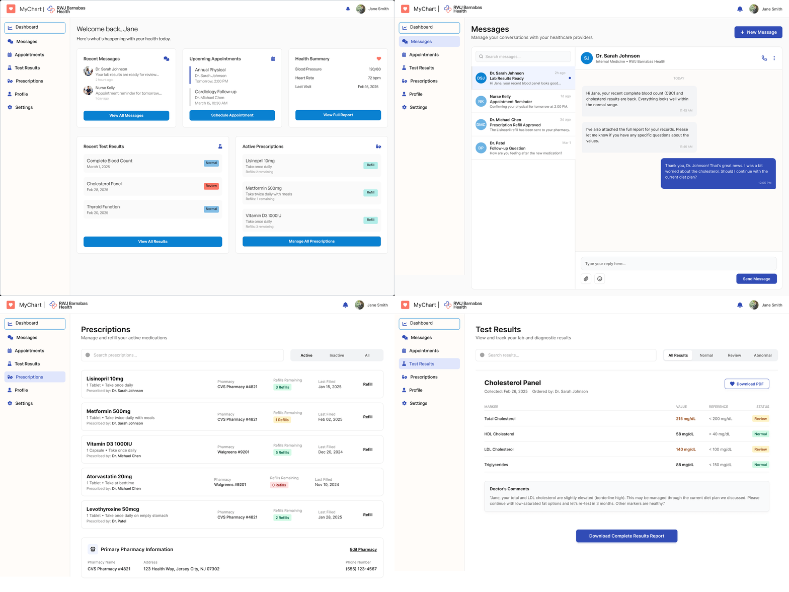
02 · Approach
The approach started from one question: does this make the patient feel seen? Not does it look on-brand, but does the patient, in this room, in this moment of fear or confusion, feel that someone designed this with them in mind? Everything followed from there. The butterfly logomark is built from two elements, a doctor and a patient, symbolically united. The photography direction leans into warmth: close-up moments, real eye contact, hands, set against a cooler, clinical palette so the warmth always reads as the figure, not the ground. The voice stays plain, calm, never clever. The system had to work for the moment a guidelines document gets opened by a marketing manager at 4pm on a Friday who has three minutes to make a decision. Consistency, in this kind of network, isn't an aesthetic choice. It's an act of compassion.
Next Project · 05
Sennheiser (From the Archive)Brand architecture, naming, and identity for Sennheiser's expansion beyond audio professionals.