Metronome
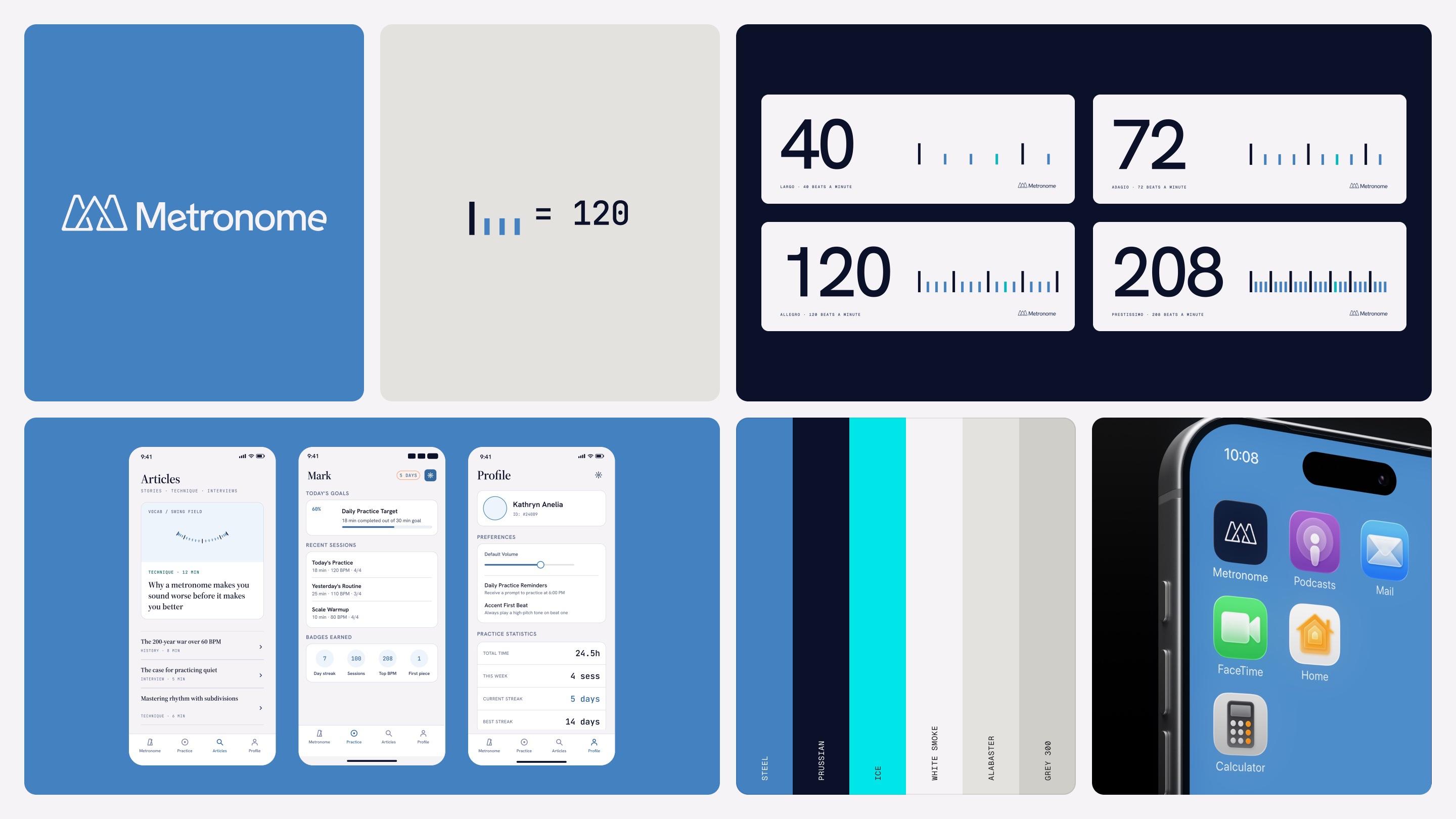
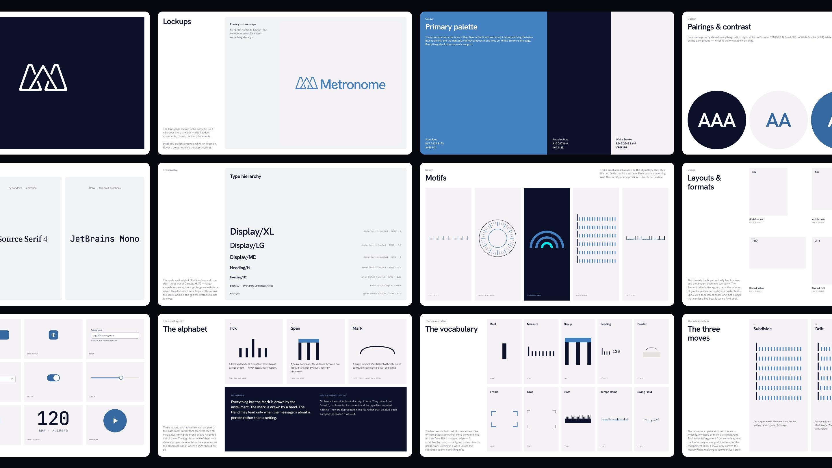
Ten years ago at ActiveColor, I designed the brand and illustrations for Metronome Online, a free practice tool for musicians. I came back to it to see how far I’d come.
- Client
- Metronome Online
- Year
- 2026
- Audience
- Musicians practising, and the readers of its library
- Type
- Speculative
- Context
- Original designer of the brand
- Outputs
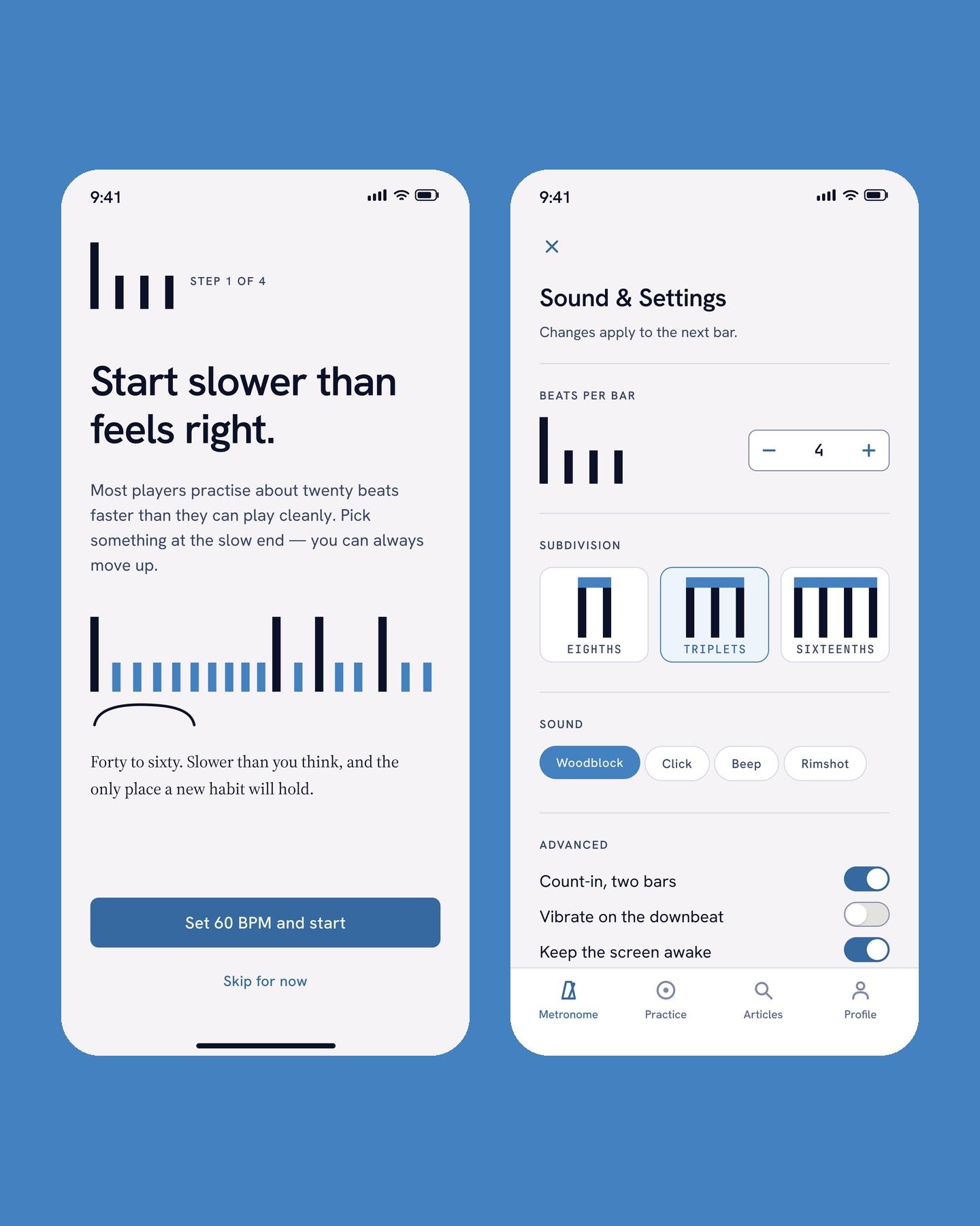
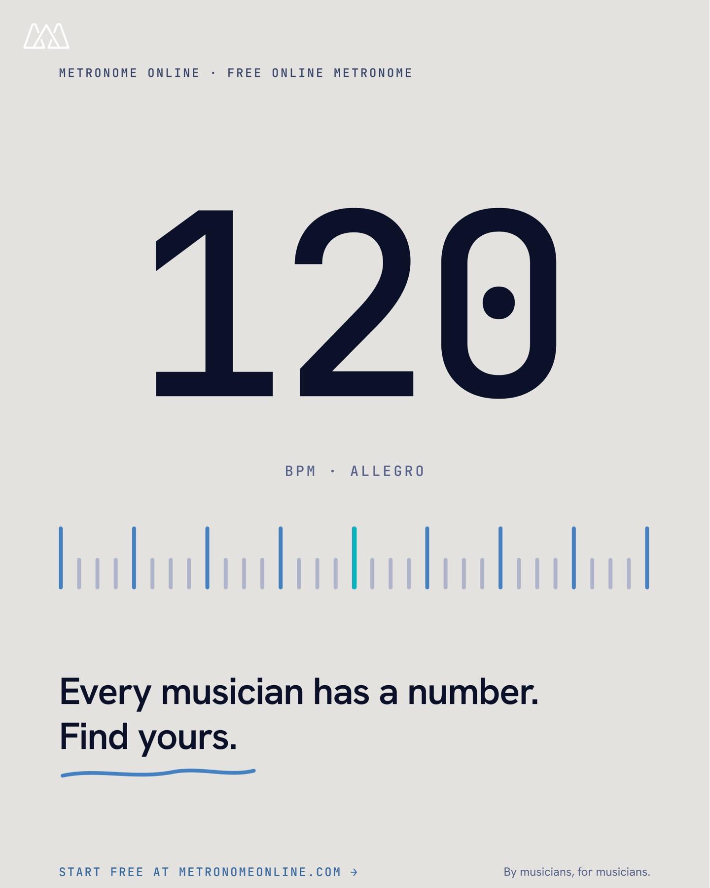
- Identity, app, practice tool, posters
The mark held up. Almost nothing around it did. The type didn’t sit well with the symbol, and the illustrations came straight out of the corporate Memphis era.
Let the subject drive the language, not my taste. The metronome itself leads, and the color, type and symbol carry the rest.
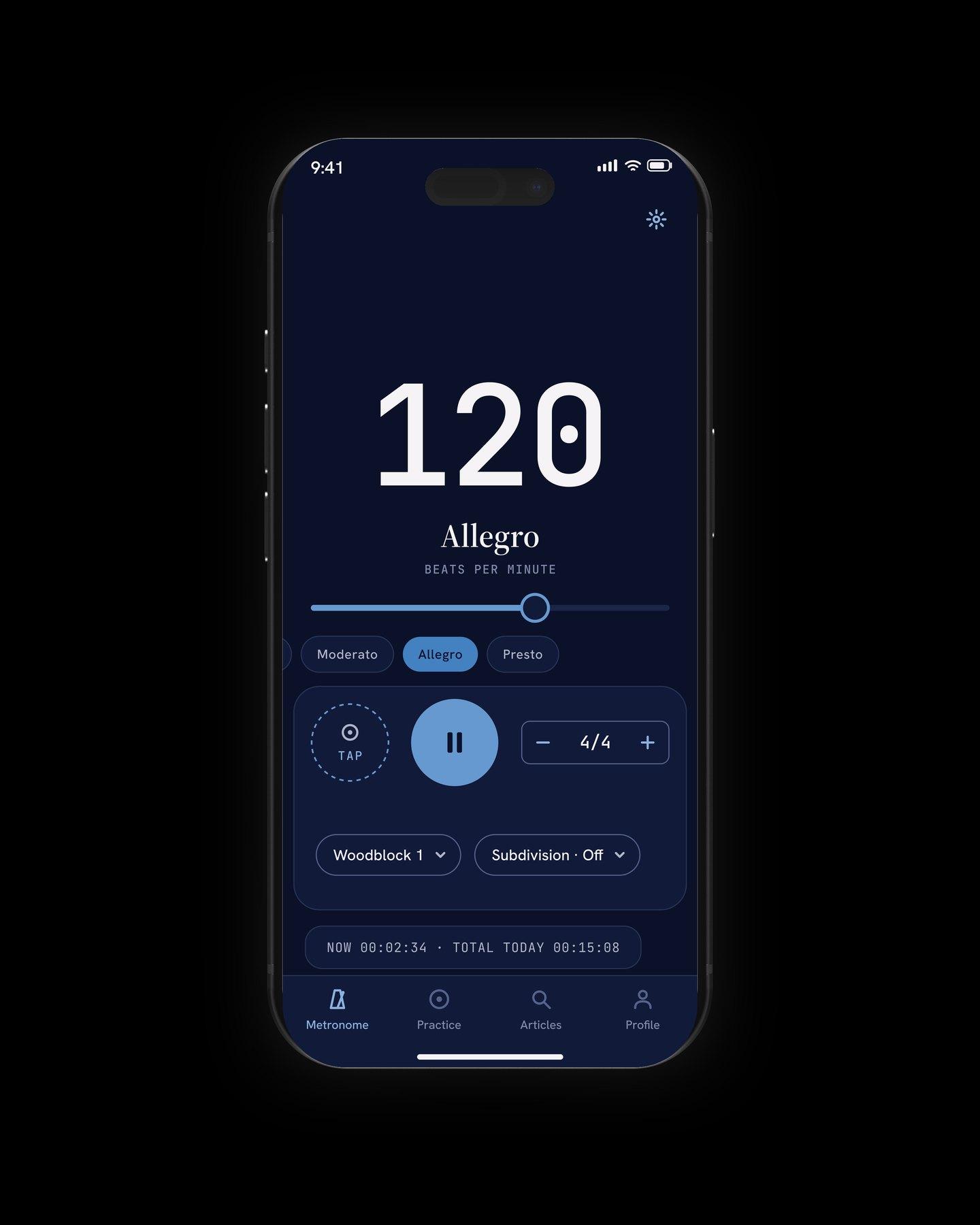
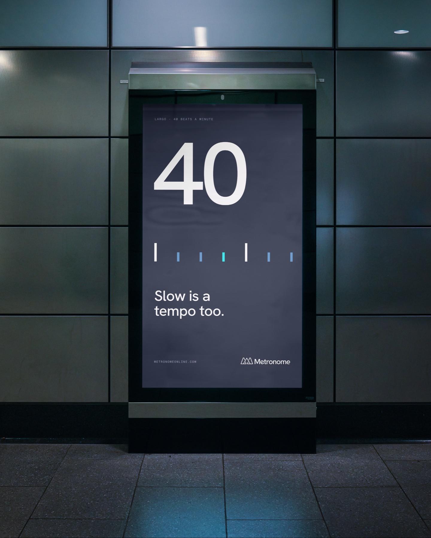
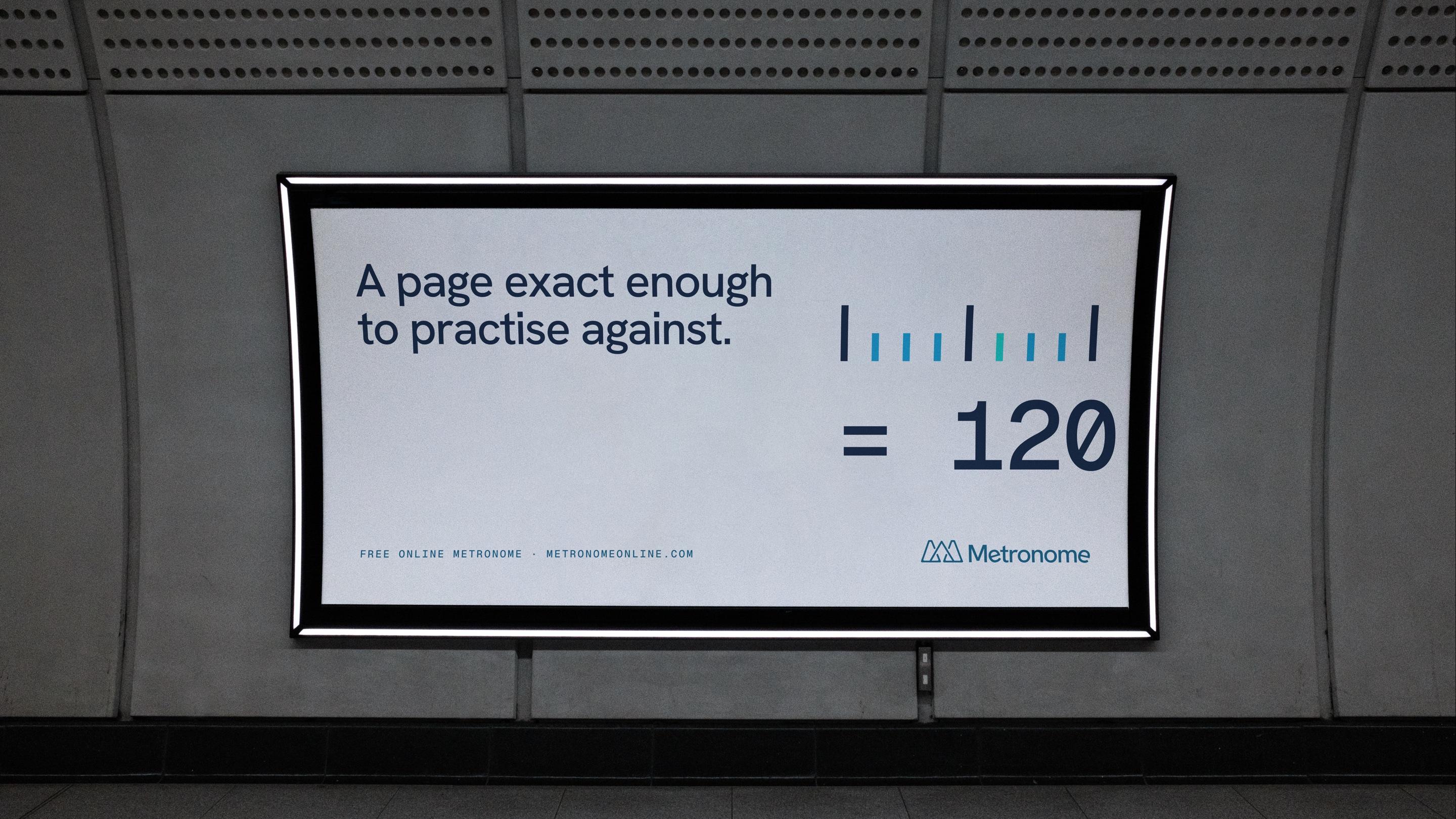
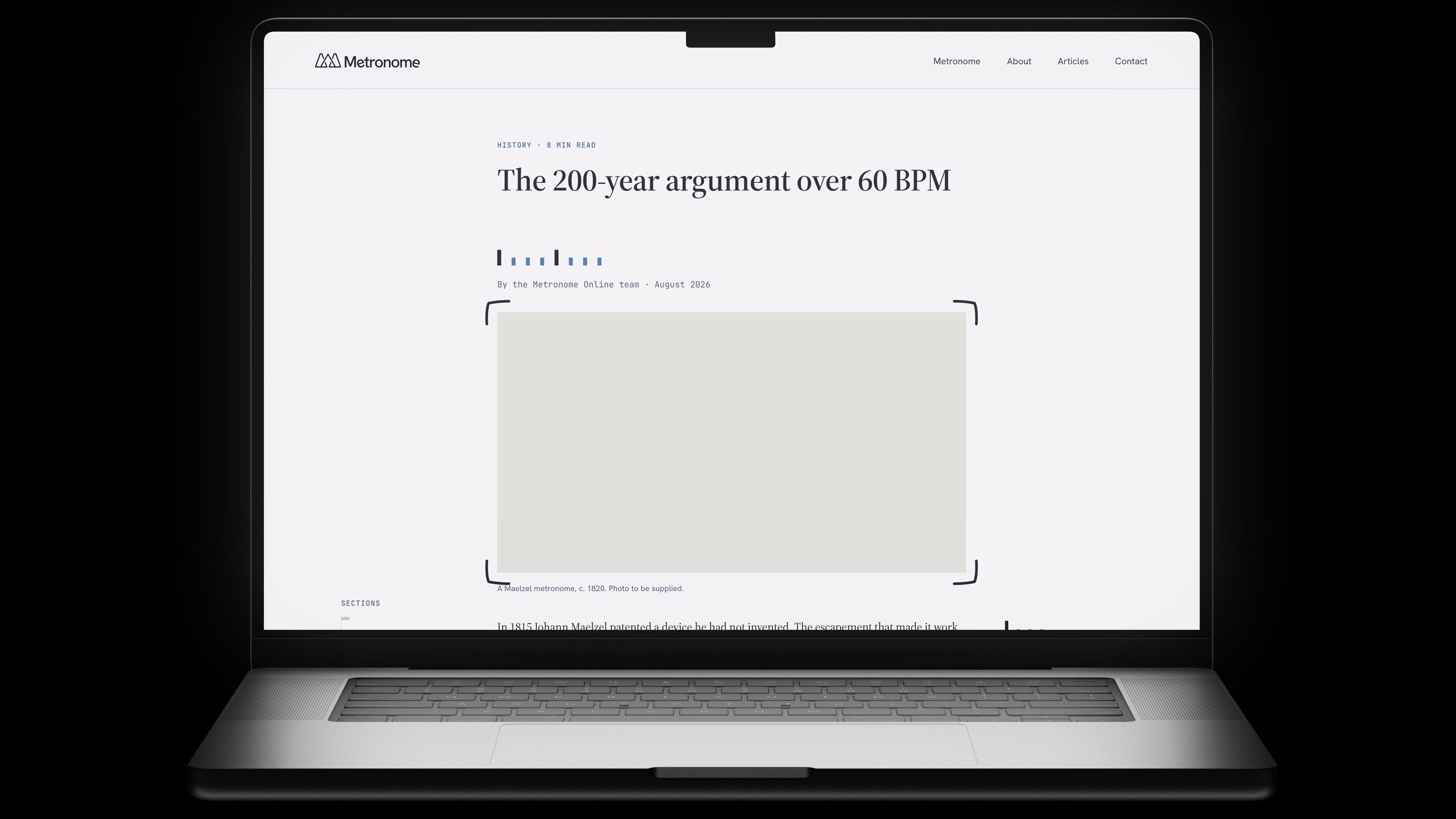
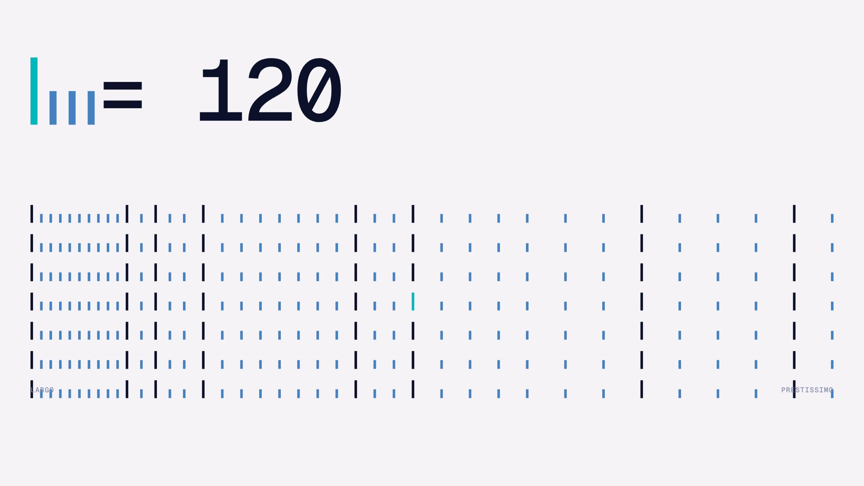
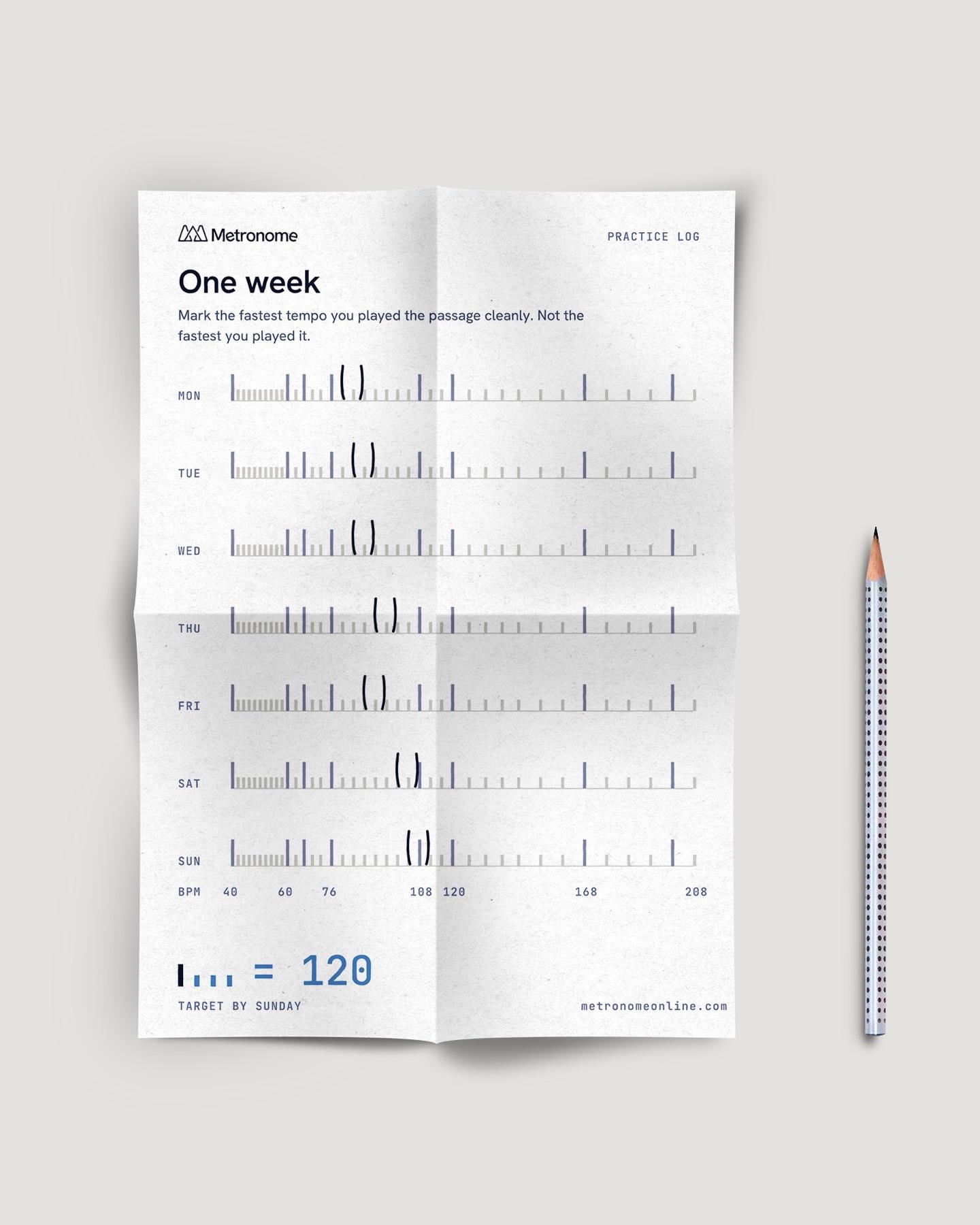
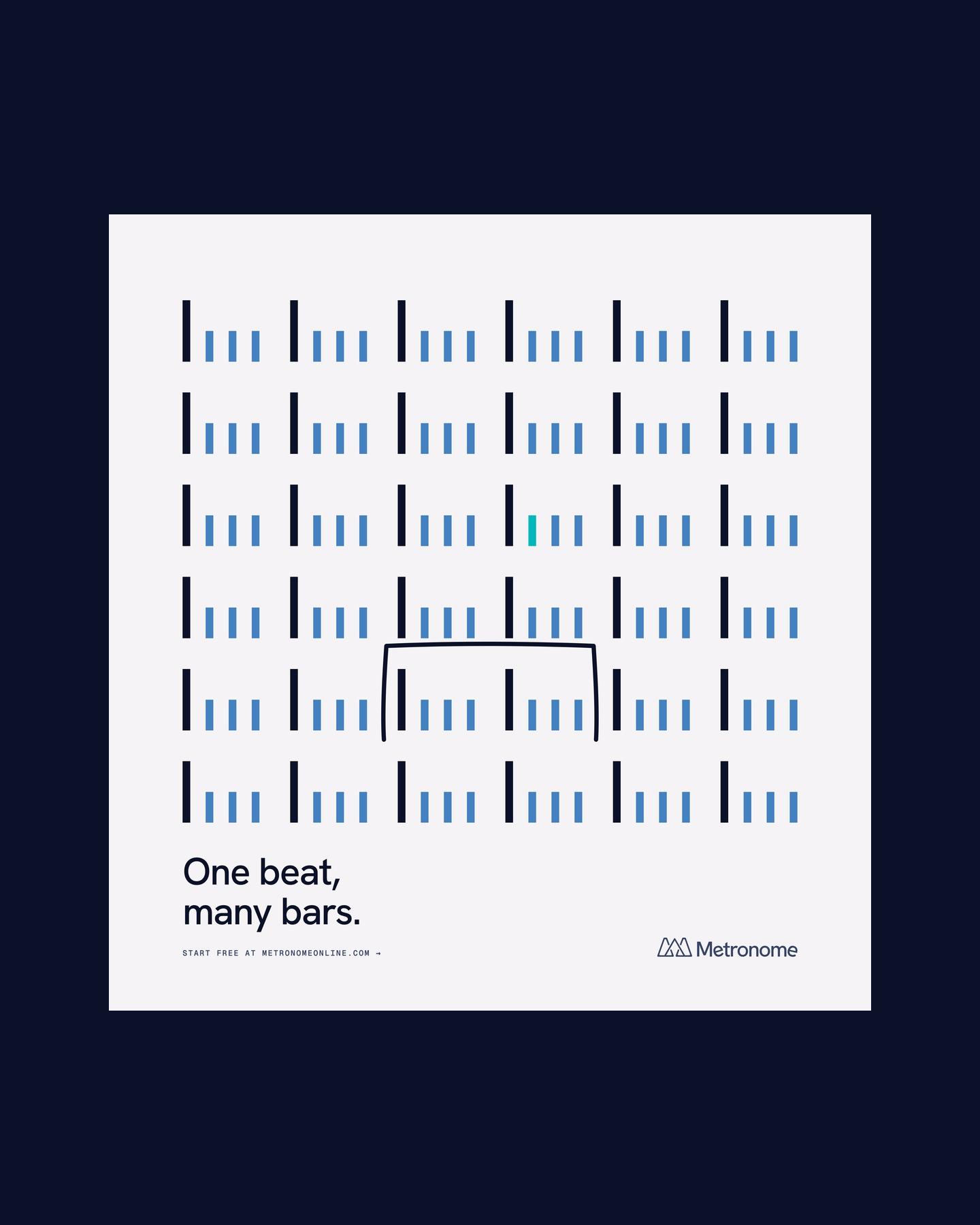
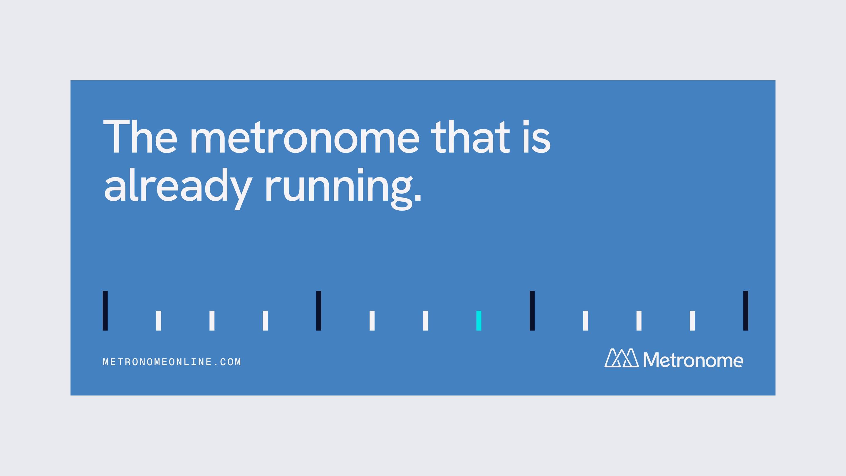
Every tick is a beat. Every form is a measurement.