LAPL
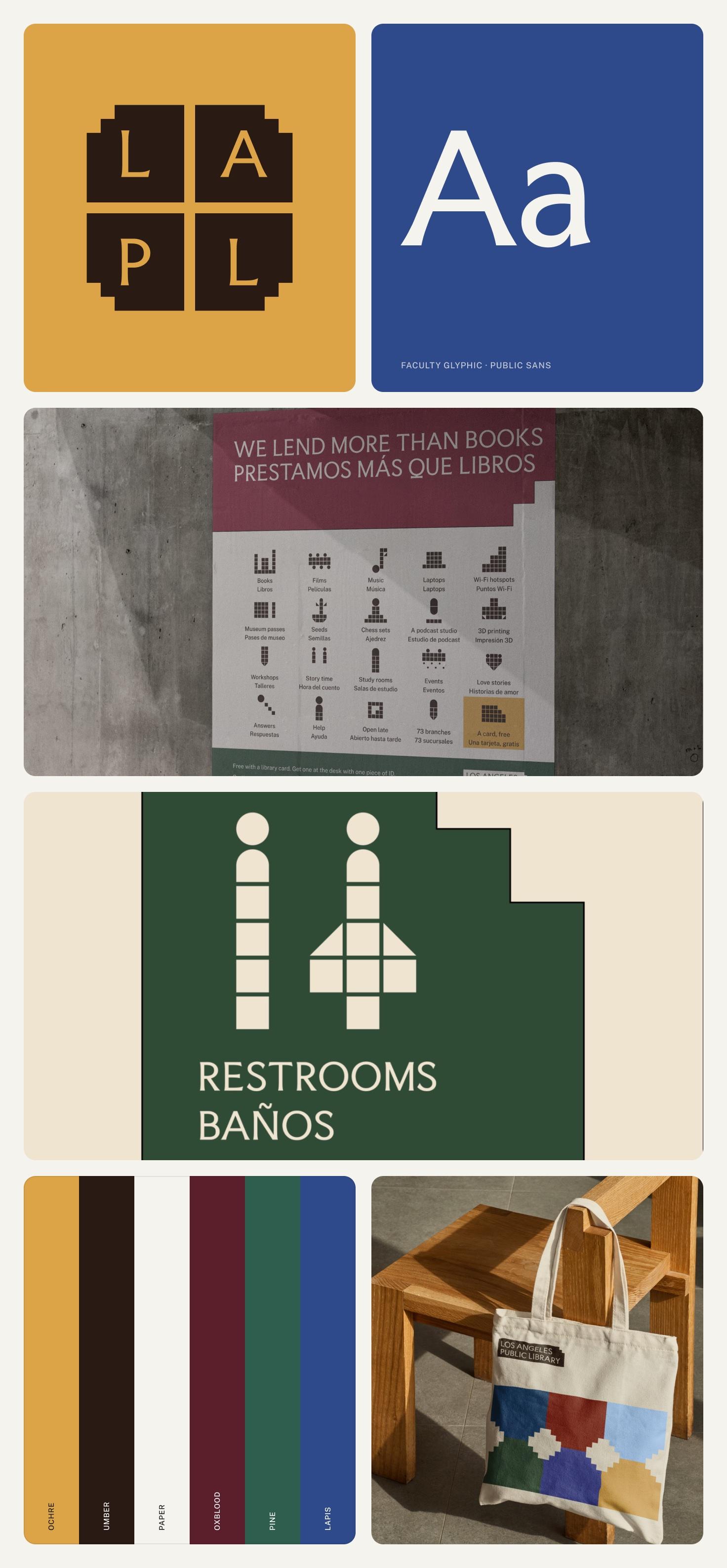
The Los Angeles Public Library is a tentpole for this city. It gives everyone free access to a ton of resources, including free help with citizenship. I wanted an identity that stands as tall as the library already does.
- Client
- Los Angeles Public Library
- Year
- 2026
- Audience
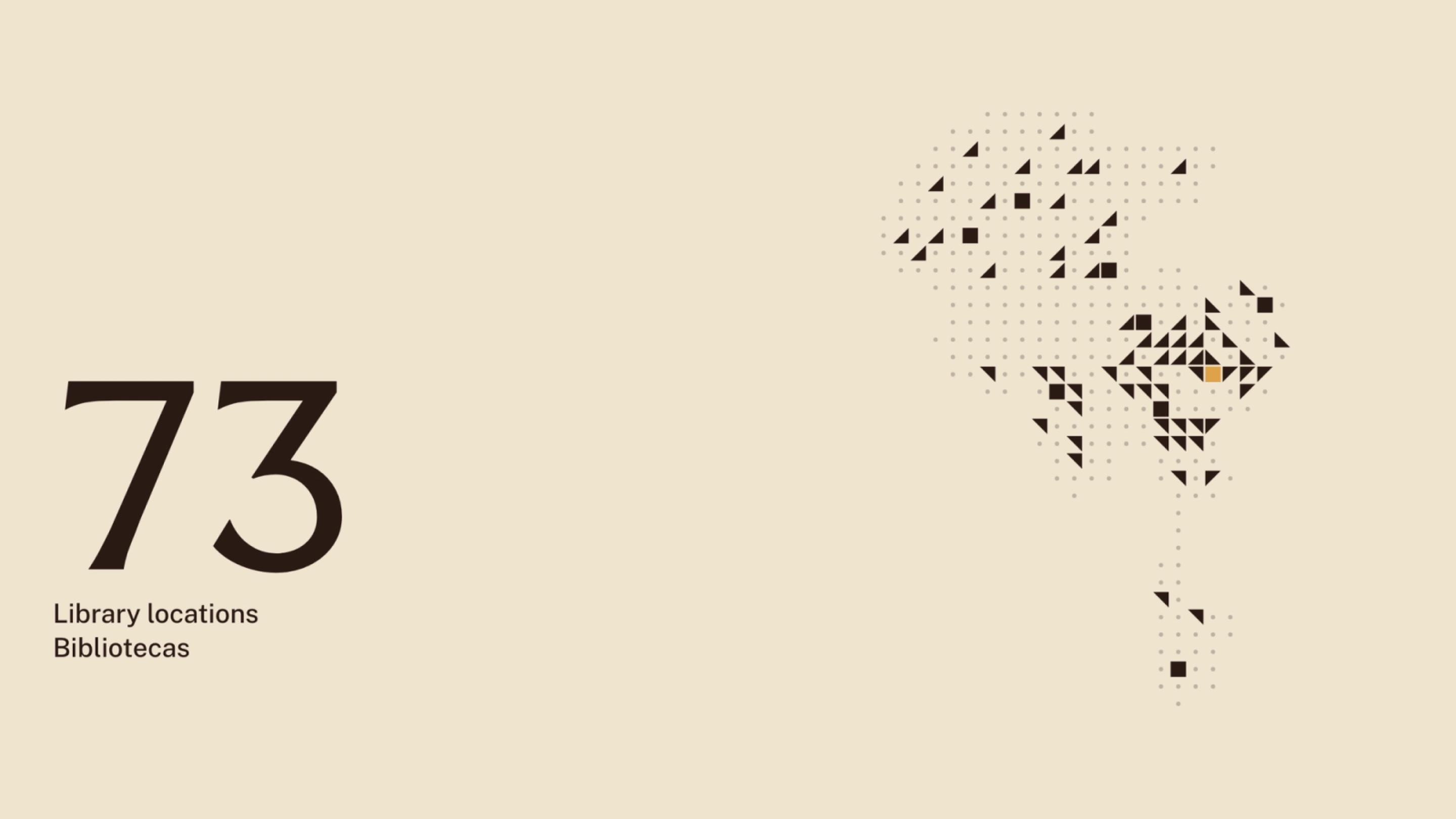
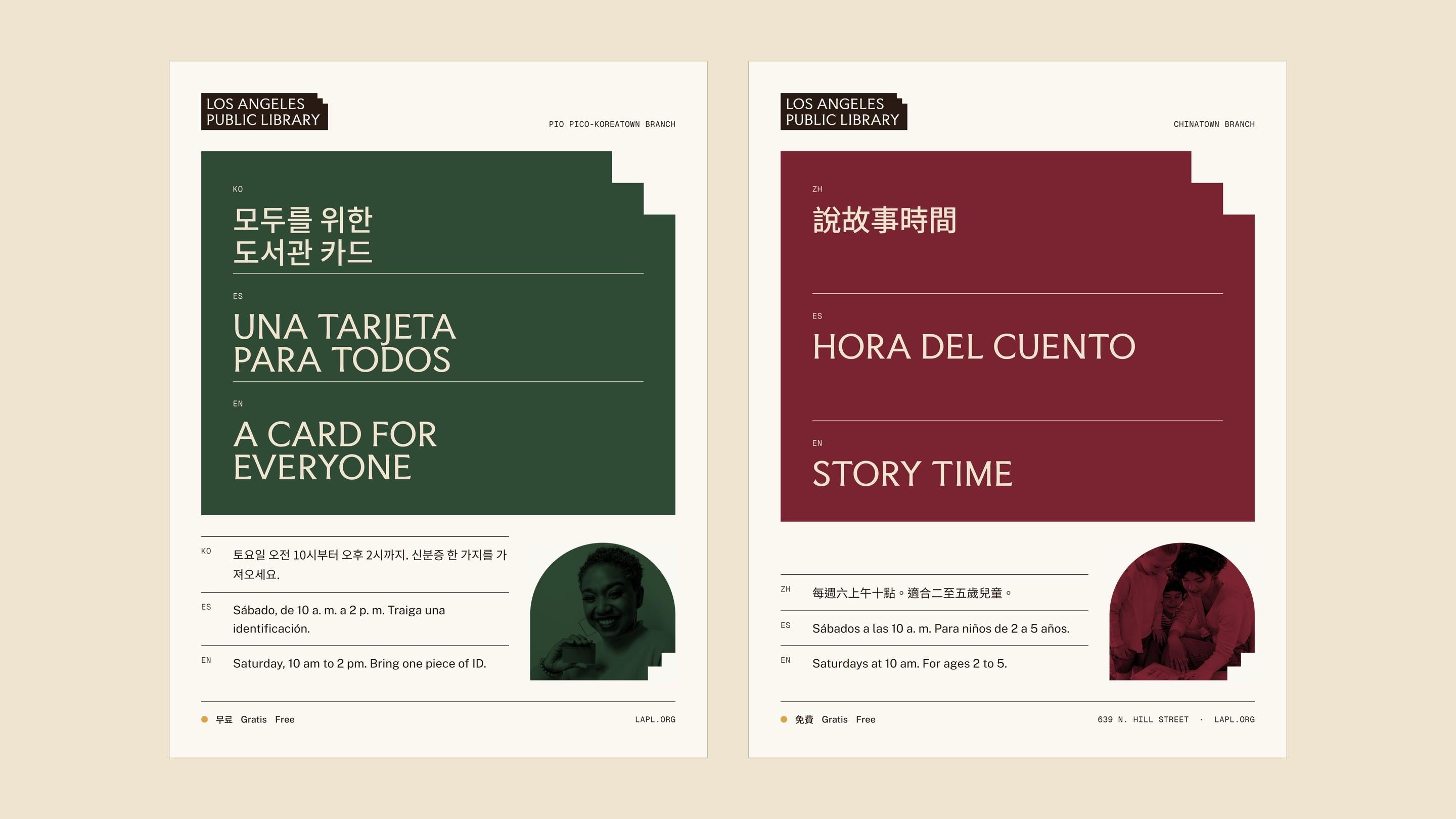
- Every Angeleno, in 15 languages, at 73 branches
- Type
- Speculative
- Context
- Unsolicited rebrand
- Outputs
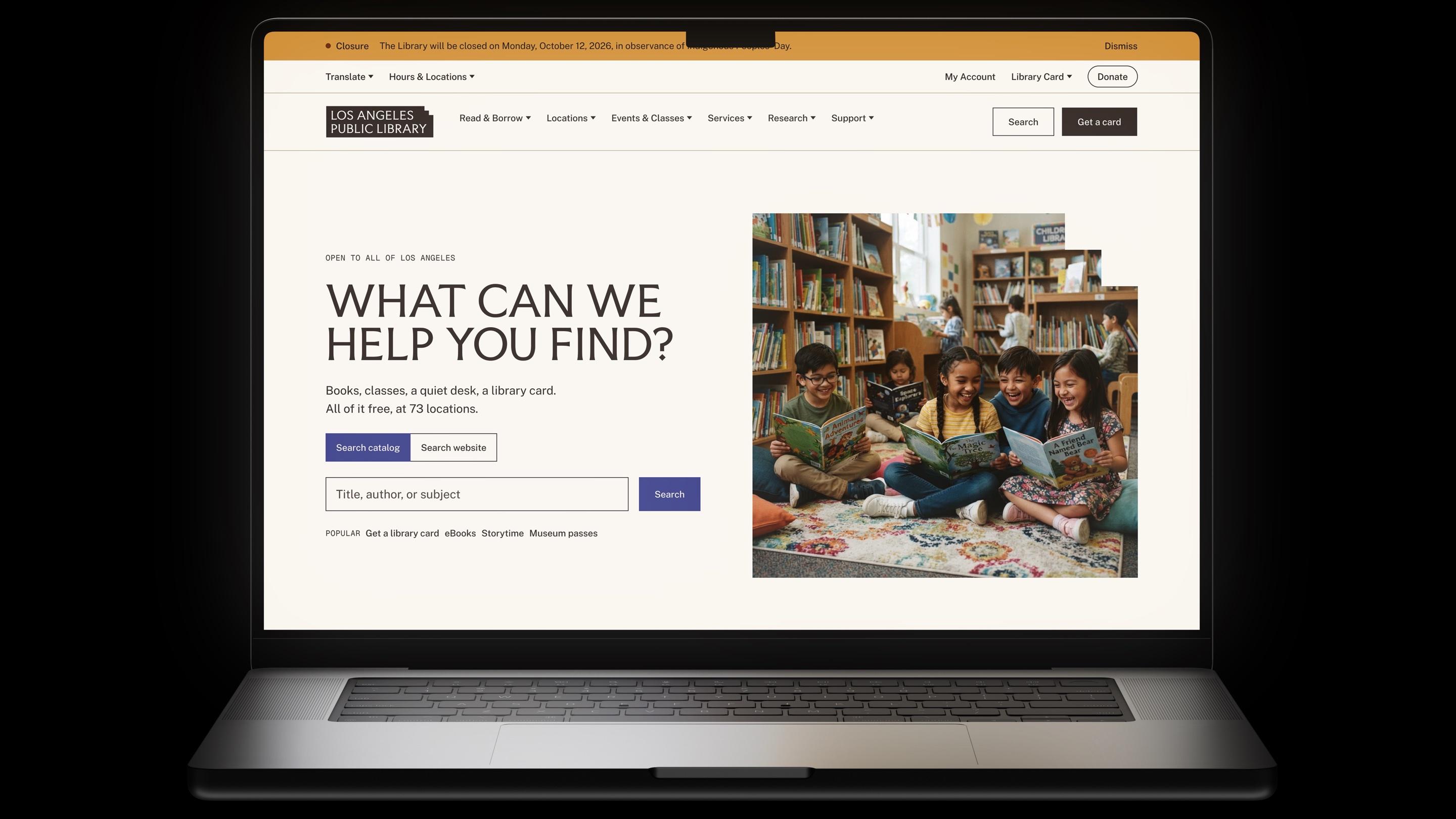
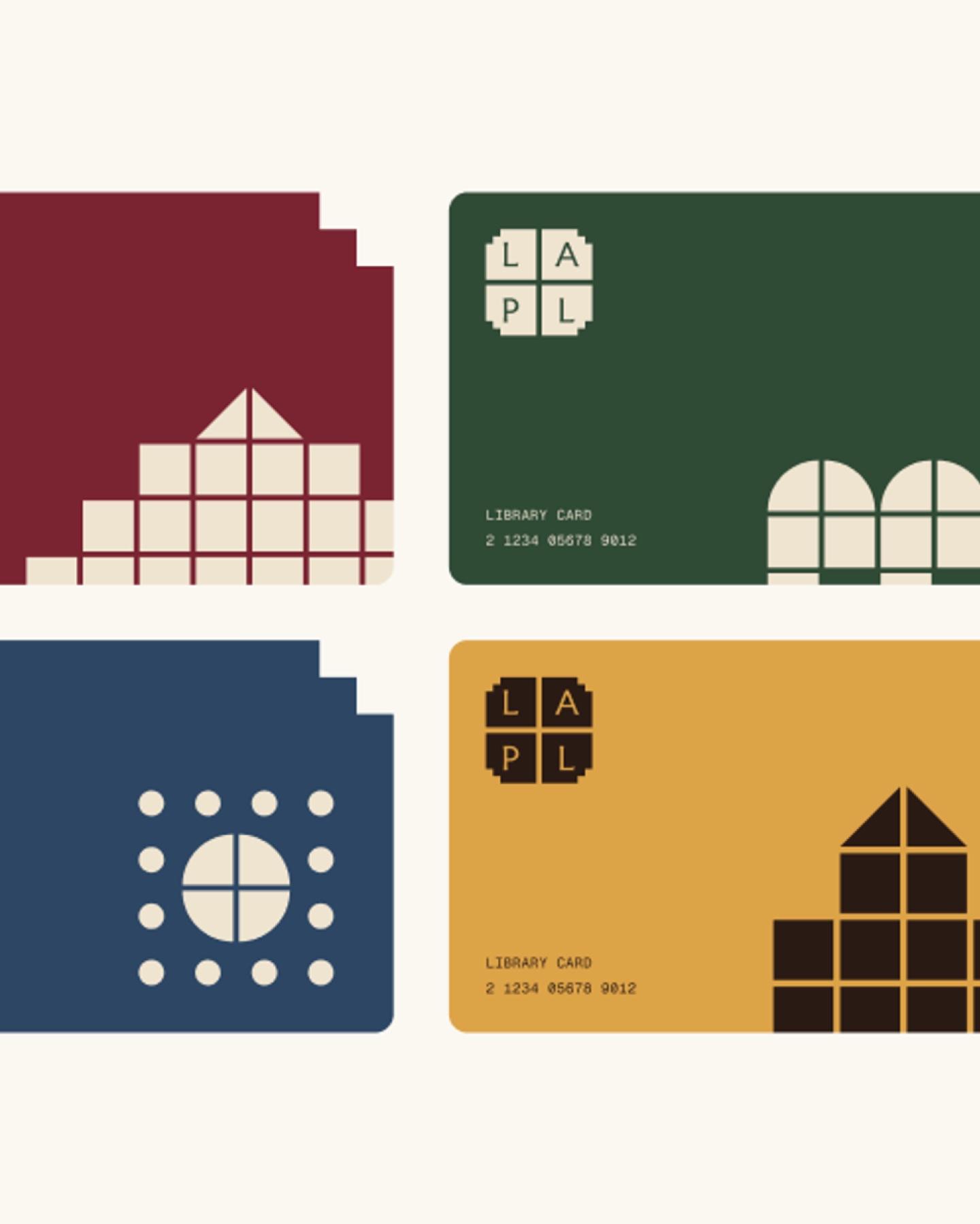
- Identity, wayfinding, library cards, web
The library holds up a lot of this city, and its identity doesn’t carry that weight. The symbol is hard to understand and hard to use, and the system struggles to stand out across 73 locations. Say “LA library” and most people see one building.
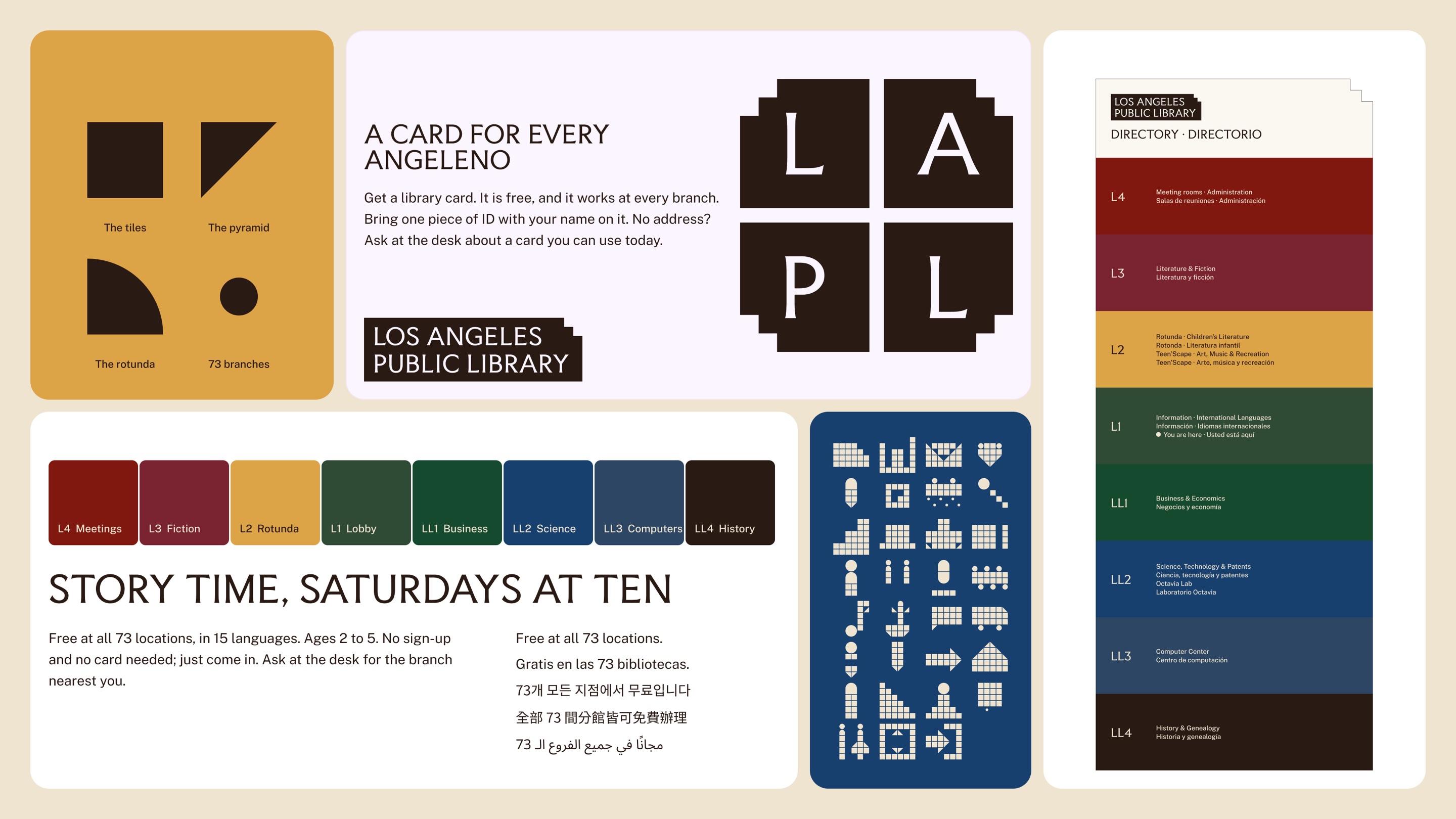
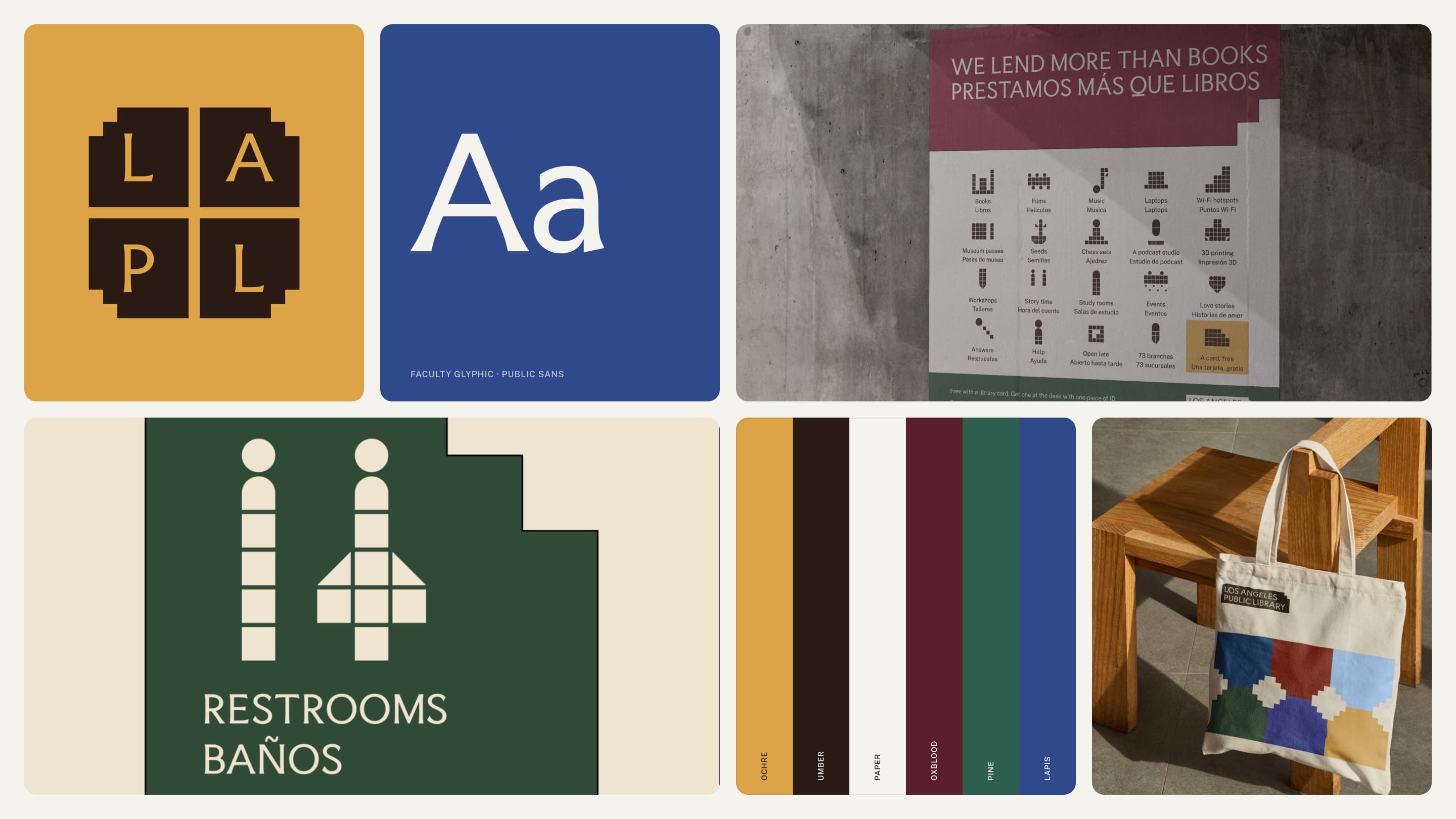
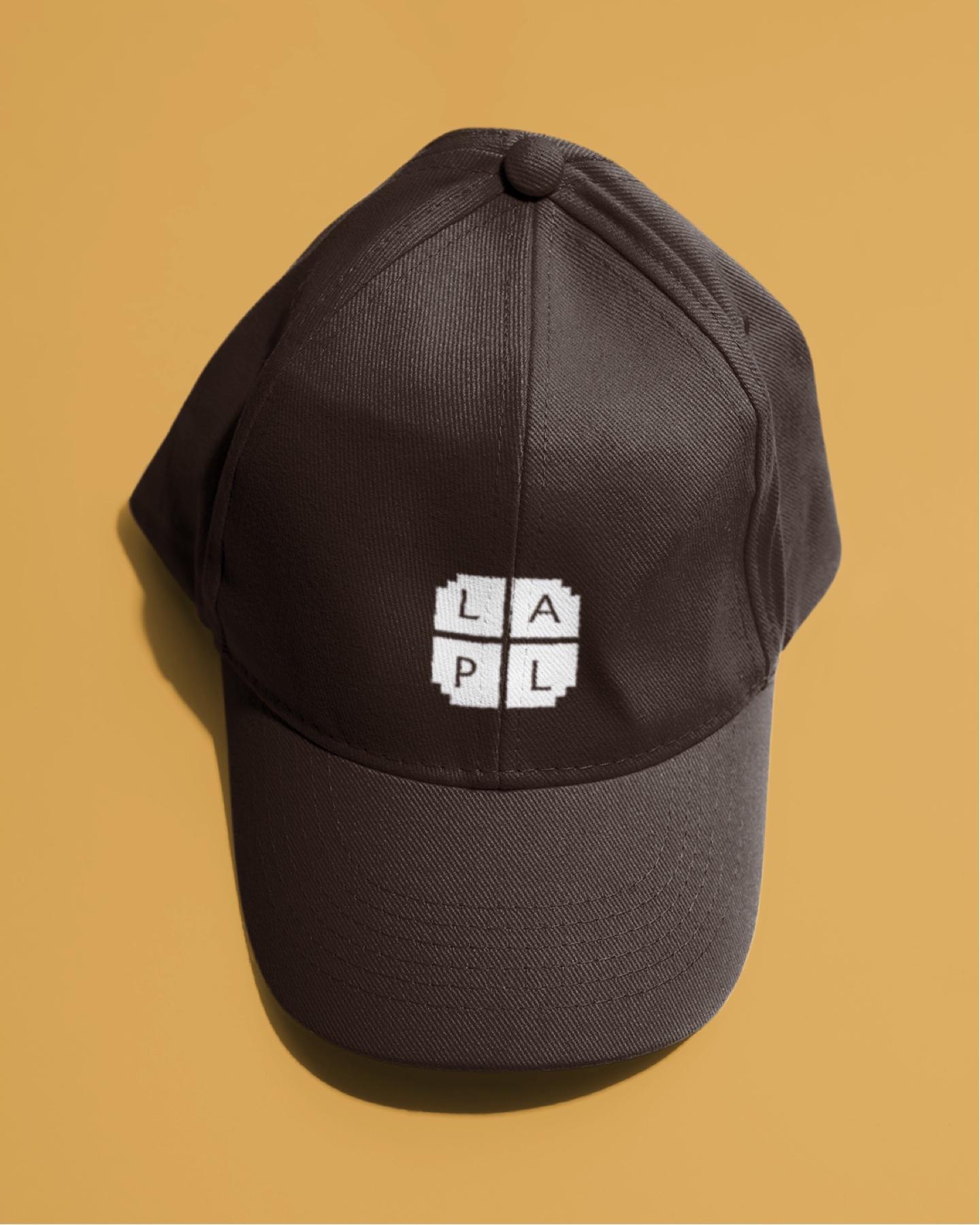
I used the Central Library itself as the source. The stepped setbacks gave the shapes, the tiled pyramid gave the colors, and the carved lettering gave the type. Inside was beautiful. Outside was the brand.
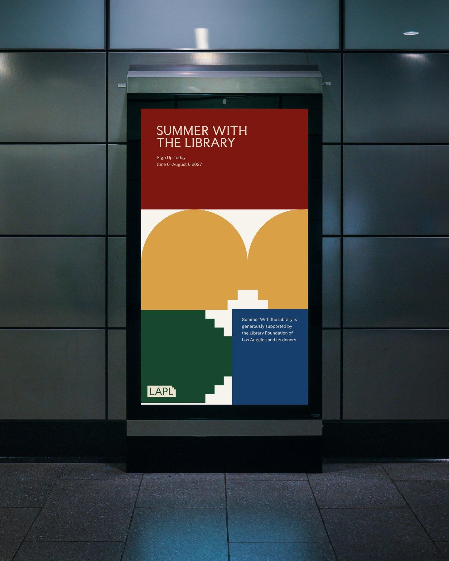
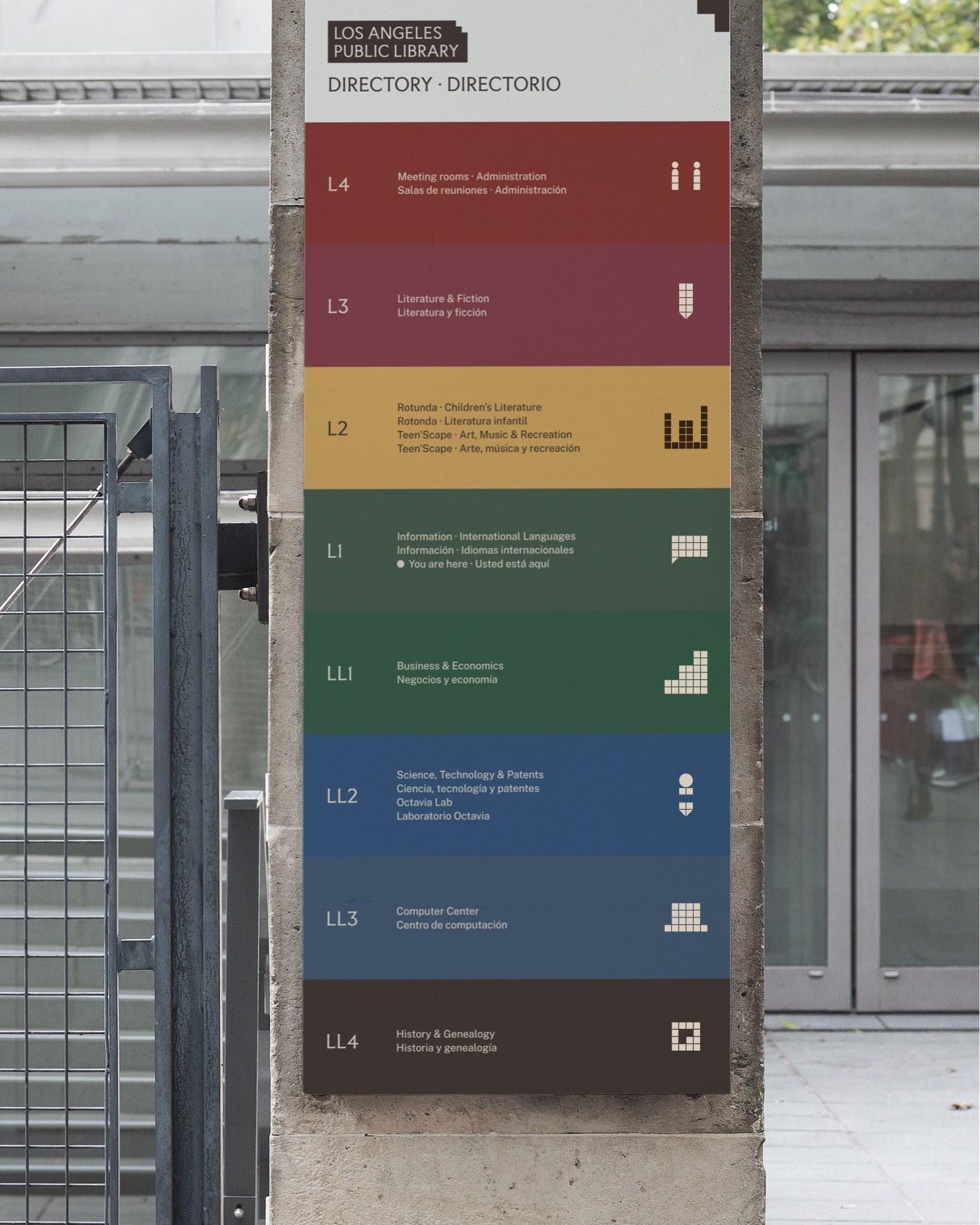
Open to All of Los Angeles. Belonging Before Becoming.